

| Typographic Design in Māori-English Bilingual Picturebooks: Some Educational Implications
Nicholas Vanderschantz, Nicola Daly and Vouchleang San |
Download PDF |
Abstract
The role of bilingual picturebooks in language learning has been explored recently by a number of authors who show their potential in normalising multilingualism (Naqvi, Thorne, Pfitscher, Nordstokke & McKeough, 2013; Zaidi, 2020), raising metalinguistic awareness and engaging parents (Sneddon, 2009), as well as raising language awareness (Kleker, Short & Daly, 2021). Hadaway and Young (2013) suggest bilingual picturebooks have a particular role to play in supporting the revitalisation of Indigenous languages. In New Zealand, the number of Māori-English bilingual picturebooks is increasing, but there is very little, if any, research concerning their design or their use in educational settings. The design of bilingual picturebooks, as reflected in their linguistic landscape, has an important role to play in their pedagogical use (Daly, 2016; 2017), and in this article, we explore the typographic design of five bilingual Māori-English picturebooks with respect to the elements of typeface, type size, type colour and page layout. We discuss the design and audience implications of these factors for educational settings.
Keywords: Te Reo Māori, bilingual picturebooks, education, design, typography
Nicholas Vanderschantz is a Senior Lecturer at the University of Waikato investigating the design of user-centred solutions to information seeking and use problems. Nicholas’ research focuses on the presentation and visualization of information in a range of contexts for users from all walks of life.
Nicola Daly is a sociolinguist and Associate Professor in the Division of Education at the University of Waikato, New Zealand, where she teaches courses in children’s literature. Her research focus is multilingual picturebooks and she was a Fulbright New Zealand Scholar in 2019/20.
Vouchleang San was a fourth-year student in Design at the University of Waikato when she worked with Vanderschantz and Daly on the research presented in this article. She has since completed her Masters of Design at the University of Waikato focusing on the reader perceptions of language hierarchies in bilingual picturebooks.
Introduction: Bilingual Picturebooks
Bilingual picturebooks are one of three kinds of dual language picturebooks: (1) Translingual picturebooks have the story told in one language with occasional words and phrases from another language; (2) Bilingual (or parallel) picturebooks have the story in two languages within the same book. The text from each language might be on the same page, on facing pages, or in separate parts of the picturebook; (3) Dual Version picturebooks are found when the same picturebook is published in separate books in different languages. Sometimes these Dual Version picturebooks are published at the same time, and sometimes a very successful picturebook in one language is much later translated into another language. In both cases, the design and the illustrations are the same. The research we describe in this article is specific to the design factors of bilingual picturebooks and the audience implications of these factors for educational settings.
There are many ways of presenting text in a bilingual picturebook, and this layout or linguistic landscape (Landry & Bourhis, 1997) tells us the status of the languages being presented and the purpose of the picturebook (Daly, 2019). Layout and design decisions will impact the success with which a reader will read and comprehend the text (Vanderschantz, 2008; 2009; Vanderschantz, Timpany, Whitehead & Carss, 2010). More centrally to our investigations here, layout and design will impact the perceptions of readers, as well as those who select the picturebooks for use with children (Vanderschantz, Timpany, Hinze, & Cunningham, 2014; Vanderschantz & Daly, in press). In this article, we examine the typographic design aspects of five New Zealand bilingual picturebooks featuring Māori-English text, in order to explore their potential use by teachers and parents and their potential role in language learning and language revitalization.
Context of this Research
Aotearoa/New Zealand is a country of many languages (Royal Society of New Zealand, 2013), with the most recent census statistics indicating that English is the language spoken by the majority of New Zealanders – 90% of the population, with Te Reo Māori spoken by 3% of the population (Te Tari Mātāwaka, 2020). While this proportion may seem low, this belies the increasing revitalization of Te Reo Māori and its importance to the national identity of New Zealanders (Daly, 2010). Kia Ukaipō Te Reo is the government strategy of having a million speakers of Te Reo Māori by the year 2040 (Te Mātāwai, 2021). Te Reo Māori, English, and New Zealand Sign Language are the three official languages of Aotearoa/New Zealand.
In this research, we focus on the typographic presentation of Māori and English text. Both of these languages use Latin scripts that are written and read left-to-right (LTR) and top-to-bottom. To date, very little research has documented how picturebooks can be used to support the use of Indigenous languages such as Te Reo Māori in educational settings (Brouwer & Daly, in press).
Literature Review: Linguistic Landscape & Multimodal Analysis
There is not a great deal of literature published concerning multilingual picturebooks; however, the importance of picturebooks featuring more than one language and the ramifications of how these languages are laid out on each page has been discussed in terms of supporting the revitalization of Indigenous languages (Hadaway & Young, 2013), supporting the development of literacy in children’s home languages, and in developing children’s language attitudes (Daly, 2018a; 2018b). There is a growing body of work exploring the use of picturebooks to support educational practice including language learning (Bland & Lütge, 2014; Hassett & Curwood, 2009; Mourão, 2015; 2016). Here we review the literature on dual language picturebooks with consideration of the linguistic landscape, multimodal analysis, and picturebook design and typography for children’s reading.
Painter (2017) uses multimodal analysis to analyse how meaning is made using both visual and verbal modes in picturebooks, showing how convergent modes are used in the illustrations and text (including typography) of Anthony Brown’s Voices in the Park to give the four perspectives of the same story. Building on the work of van Leeuwen (2006), Serafini and Clausen (2012) explore the contribution of typography to meaning making in picturebooks. They argue that ‘typography is a visual element and a social semiotic resource with its own meaning potentials’ (p. 2). Using five monolingual picturebooks they explore the potentials of typographic weight, colour, size, slant, framing, formality and flourishes to contribute to meaning making.
There has been little exploration of typography in bilingual and multilingual picturebooks; however, there have been a number of studies analysing what is known as the linguistic landscape of bilingual and multilingual picturebooks featuring a range of languages. The linguistic landscape (Landry & Bourhis, 1997) of a picturebook is a critical analysis of which languages are present and how they have been presented in terms of order, type size, and type weight on the ‘outer’ (cover and flaps), ‘inner’ (endpapers, front matter and back matter) and the body of the picturebook (Daly, 2019). The importance of this linguistic landscape is that it can reflect and support existing attitudes towards languages and has the potential to disrupt linguistic hegemonies. Daly (2018a), for example, examined eight bilingual picturebooks in The White Ravens catalogue of the International Youth Library in terms of how the two languages within each book were presented. Daly showed that the outer and inner pages of these books were often dominated by a colonial language, whereas in the story, the languages were treated more evenly. Daly (2018a) explains that:
On the two-dimensional surface of a picturebook page, there is competition for space and attention, and it is crucial that anyone dealing with these texts, whether they be publishers, designers, readers or teachers, realises that the placement of text for different languages within a dual language picturebook communicates messages indicating the relative importance of the languages in question. (p. 111)
In another study, Daly (2018b) examined over 200 Spanish-English bilingual picturebooks at the Marantz Picturebook Collection for the Study of Picturebook Art, based at Kent State University. Daly discussed the contribution of the presence of Spanish in these books to reinforcing the ethnolinguistic vitality of the Spanish speaking community in the United States of America. Further, Daly highlights the potential that these books have to influence language attitudes of the broader US population.
Researchers have also explored the intercultural impact of bilingual picturebooks. Kümmerling-Meibauer (2013) discusses bilingual picturebooks as providing readers with knowledge of diverse cultures, injecting respect for other languages, and supporting intercultural learning. Qiaoya and Xiaoning (2016) add that ‘bilingual children’s books can lead minority children to future success because they feel included in the school curriculum’ (p. 476). Daly (2017) also argues that presenting a story featuring someone who is familiar allows the reader to become more engaged with the story.
The role of bilingual picturebooks in language learning has been explored recently by a number of authors who show their potential in terms of language learning (Bland & Lütge, 2014), normalising multilingualism (Naqvi et al., 2013; Zaidi, 2020), raising metalinguistic awareness and engaging parents (Sneddon, 2009), as well as raising critical language awareness (Kleker et al., 2021). Ibrahim (2020) in particular, explores the potential of multilingual picturebooks in English as a Foreign Language (EFL) classroom, arguing that ‘it is a fundamental right of children to access their language repertoire, not just as a one-off scaffolding technique or a tolerated approach, but as an acknowledgement of their plurilingual identity’ (p.16). Ibrahim notes that multilingual picturebooks in an EFL classroom can be used to foster multilingual critical awareness and translingual skills. Similarly, Kersten and Ludwig (2018) explore the potential of multilingual children’s literature to support language learning, plurilingual literacies, and metalinguistic awareness, creating a translanguaging space in the classroom. Daly (2018a) has suggested that bilingual picturebooks can be used to alter language hierarchies which can impact language attitudes, and Hadaway and Young (2013; 2018) in their study of bilingual picturebooks from Australia, New Zealand, and Canada suggest that this format has a particular role to play in supporting the revitalization of Indigenous languages.
It is clear from the literature that picturebooks featuring more than one language have considerable pedagogical potential. While there have been studies of the linguistic landscape of bilingual picturebooks in Aotearoa/New Zealand (Daly, 2016; 2017) there is little published, if anything, focusing on specific design elements of the text in bilingual picturebooks.
Design of Picturebooks for Readers
The picturebook literature is diverse and research can be found across a range of domains, including linguistics, children’s literature, semiotics, and education (Bland & Lütge, 2014; Callow, 2018; Lewis, 2012; Mourão, 2016; Timpany, Vanderschantz, Hinze, Cunningham & Wright, 2014; Vanderschantz, Timpany & Wright, 2020). We note there is also a somewhat limited body of work investigating the interactive design of picturebooks (Figueiredo, Pinto, Branco, Zagalo & Coquet, 2013; Timpany & Vanderschantz, 2012; 2013; Vanderschantz & Timpany, 2012). Our specific interest in this article relates to the typographic design of picturebooks and the remainder of this section will therefore focus on typography considerations related to picturebook design and reader perception.
Typography is the term used to describe the layout, design and text presentation of written language. Typography research has given guidance for the presentation of children’s text (Dyson & Kipping, 1998; Walker, 2005; Walker & Reynolds, 2000). This research can be found across a range of domains, including psychology, education and design, and typography and is typically focussed on single language reading situations and the ease with which a text can be read (Burt, 1959; Fukuzumi, Yamazaki, Kamijo & Hayashi, 1998; Lonsdale, 2014; Pettersson, 2010; White, 2005). Bilingual picturebooks present the complete story text in two languages and therefore provide a unique typographic context for investigation. While there is literature exploring text, language, and typography in children’s reading material (Bernard, Chaparro, Mills & Halcomb, 2002; Hughes & Wilkins, 2000; Katzir, Hershko & Halamish, 2013; Pantaleo, 2014), there does not appear to be a significant body of literature explicitly discussing the design of text presentation in bilingual picturebooks.
Kress (2003), Hassett and Curwood (2009), and Serafini and Clausen (2012) discuss how typography in picturebooks provides meaningful semiotic information for readers. The combinations of text and image can support and complement each other to provide the holistic communication of the picturebook. Supporting our argument here, Phinney and Colabucci (2010) suggest that the visual presentation of text and image work together to construct meanings for readers that are complex and multimodal. It is further recommended that supporting readers to understand and interpret the semiotic considerations of picturebooks will develop the skills necessary to use and comprehend picturebooks (Phinney & Colabucci, 2010; Serafini & Clausen, 2012). Pantaleo (2014) reports a study with 8- and 9-year-old children who were able to identify how typography in picturebooks reflected and enhanced the meaning of the written text.
Therefore we posit that it is clear that typographic decisions made by designers can be used to extend meaning, but may also be interpreted by a reader to signify or denote a perception not intended by the designer, author, or publisher. Experiments by Brumberger (2003) and Shaikh, Chaparro and Fox (2006) show that the ‘personality’ or ‘persona’ of a typeface (for example whether the typeface appears friendly, serious, casual, youthful, or mature) impacts reader perceptions. Further to this, van Leeuwen (2005) discusses the impact of connotations that typefaces bring with them in communication, noting that not only the denotation of the text but also the connotation of the typeface is of consideration in how a written communication will be interpreted. This is supported by Bellantoni and Woolman (1999), who suggest that typeset words and texts have two levels of meaning which they define as the ‘word image’ (the idea presented or denoted by the word itself) and the ‘typographic image’ (the visual ideas or impressions provided by the typeface choice).
Picturebook text can be found both within the body of the book as well as on the cover. The cover of a book serves to invite the reader to open the book, to explore the content inside, and to inform the reader about what they might expect (Haslam, 2006; Kratz, 1994; Vanderschantz & Timpany, 2013; Weedon, 2007). The importance of the book cover cannot be overestimated; Sonzogni (2011) suggests that ‘the book cover provides the (potential) reader with a visual summary of the book’s contents’ (p. 4), while Weedon (2007) describes book covers as ‘a doorway through which we glimpse the text’ (p.117). For this reason the imagery, typography, and information provided on the cover of a picturebook are likely to influence reader perceptions and must be considered with regard to the design and audience implications of these factors for educational settings.
Method
To explore the design layout of Māori-English bilingual picturebooks, we selected five picturebooks published in Aotearoa/New Zealand between 1983 to 2015 (see Table 1 and Figure 1). We selected books across this time frame in which the status of Te Reo Māori and its use in educational contexts have experienced rapid change in Aotearoa/New Zealand. That change can be considered to have begun with the establishment of a series of educational institutions; the first Wānanga (tertiary education), Te Whare Wānanga o Raukawa in 1981 (Calman, 2012), the establishment of Ngā Kohanga Reo (early childhood education) in Wainuiomata in 1982, and the establishment of the first Kura Kaupapa Māori (primary and secondary education) at Hoani Waititi Marae in 1985. Following these developments, Te Reo Māori was established as an official language of Aotearoa in 1987. Finally, an indicator of this change in more recent times has been the Ministry of Education now actively encouraging the increased use of Te Reo Māori in all English medium schools (Ministry of Education, 2015).
| Are you my mother? | Kua ora i a Kōtuku
Kōtuku saves the day |
Te kōpua pōhatu The rock pool |
He rākau Raukawa tēnei
This is a Raukawa |
10 Goofy Geckos | |
| Year | 1983 | 2002 | 2003 | 2014 | 2015 |
| Publication Location | Aotearoa
New Zealand |
Aotearoa
New Zealand |
Aotearoa
New Zealand |
Aotearoa
New Zealand |
Aotearoa
New Zealand |
| Publisher | Collins | Allan Brown | Great Potentials Foundation | Raukawa Charitable Trust | Scholastic |
| Author (Māori) | Hirini Melborne | Rohe Harrison | Kerehi Waiariki | Charlie Tepana | Ngaere Roberts |
| Author (English) | Philip Dey Eastman | Vince Ford | Patricia Grace | Charlie Tepana | – |
| Illustrator | Philip Dey Eastman | Kelvin Kirk | Gavin Bishop | Hākopa Pore | Deborah Hinde |
Table 1. Publishing details of five chosen picturebooks
|
Are You My Mother? (1983)
|
Kua Ora i a Kōtuku. Kōtuku Saves the Day. (2002) |
Te Kōpua Pōhatu. The Rock Pool. (2003)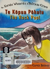 |
He Rākau Raukawa Tēnei. This is a Raukawa. (2014) |
|
10 Goofy Geckos. (2015)
|
|


Figure 1. Overview of five selected picturebooks
The books were also chosen to represent different layout designs, including having both languages presented on the same page, one language on the verso and the other on the recto, and one picturebook where English is in the first half of the book and Māori in the second half of the book. For this study, we considered the typographic presentation on the cover and the body of the picturebooks and the title page information of the book. We analysed the typographic presentation using the linguistic landscape approach established by Daly (2019). We analysed the following design elements of the visual hierarchy on the picturebook page: (1) typefaces used, (2) type size, (3) type colour, and (4) page layout. Analysis of other aspects of the picturebook including story, illustration, and endpapers is not included in this article. Table 2 below, shows how each of these design elements of the body of the book were identified and analysed.
| Design element | How it was measured / identified |
| Typeface | We identified the typeface used for each language. |
| Type size | The type size of each typeface used was measured using a type gauge (Yelland, 2003) measured in points. The same capital letters from both English and Māori text in each book where found and measured. |
| Type colour | Type colour is identified as the colour of text being presented. |
| Page layout | Page layout refers to how the text is being presented on the page: Same page; facing pages; separate sections. |
Table 2. How design elements were measured and identified
Findings
Our findings are presented with consideration of the typographic insights provided by the covers of the books. Following this we undertake a deeper visual analysis of the typeface, type size, type colour and page layout of the inside body of the books. We finally discuss the content of the title pages of each picturebook.
Cover typography analysis
When we take into consideration the text on the covers of the five picturebooks selected for review (see Figure 1) we note that three out of the five picturebooks (Kua Ora i a Kōtuku. Kōtuku Saves the Day., Te Kōpua Pōhatu. The Rock Pool., He Rākau Raukawa Tēnei / This is a Raukawa) present the name of the book in both languages, while the remaining two books present only the English name for the book. The three books that present the name of the book in both languages present the Māori name above the English name in all cases. Kua Ora i a Kōtuku. Kōtuku Saves the Day, presents the Māori and English text in two different typefaces, with the same type size for both languages. Te Kōpua Pōhatu. The Rock Pool, and He Rākau Raukawa Tēnei /This is a Raukawa present the Māori text larger than the English text and both languages in different colours.
Body typography analysis
Typeface. In the five picturebooks analysed, some used the same typeface for Māori and English text, and others differentiated between the two languages in the typeface used (see Table 3). We present the text in columns two and three in an indicative typeface to illustrate the typefaces used in the picturebooks. These typefaces are not intended to be the exact typefaces used by the publishers.

Table 3. Selected picturebooks: Typefaces
Three out of five (Are You My Mother?; Te Kōpua Pōhatu. The Rock Pool; 10 Goofy Geckos) of the picturebooks selected use the same typeface. Are You My Mother? and Te Kōpua Pōhatu. The Rock Pool both use an old-style Roman serif typeface. However, the Māori text in Are You My Mother? is presented in italics, and thus the texts are differentiated typographically despite the use of the same typeface. The use of italics to indicate ‘foreign’ or ‘other’ language is a convention in many style guides (see APA 7th Edition, for example, American Psychological Association, 2019). Thus the use of italics in bilingual picturebooks may communicate attitudes to languages in ways probably not intended by the book designers. One out of five analysed picturebooks, Kua Ora i a Kōtuku. Kōtuku Saves the Day, uses a different typeface to distinguish the two languages. This book presents English in a Gothic Sans Serif typeface, and Māori in a Roman Serif typeface.
In summary, three of the five picturebooks did not distinguish between the text of the two languages using typeface, but two of them did make a distinction – one used different typefaces and one used italics in the same typeface for Māori.
Type size. When analysing the type size, we used a type gauge (Yelland, 2003), using points (pt) as a unit of measure. The same capital letters from both English and Māori text in each picturebooks were then found and measured. The results are shown in Table 4.
| Book Title | English Type Size |
Māori Type Size |
Comparison |
| Are You My Mother? | 16pt | 16pt | Same Size |
| Kua Ora i a Kōtuku. Kōtuku Saves the Day. |
26pt | 24pt | English Larger |
| Te Kōpua Pōhatu. The Rock Pool. |
14pt | 14pt | Same Size |
| He Rākau Raukawa Tēnei. This is a Raukawa. |
22pt | 28pt | Māori Larger |
| 10 Goofy Geckos | 38pt | 18pt | English Larger |
Table 4. Selected picturebooks: Type size
Two out of the five picturebooks (Are You My Mother? and Te Kōpua Pōhatu. The Rock Pool) use the same type size for both English and Māori. Three out of the five titles (Kua Ora i a Kōtuku. Kōtuku Saves the Day, He Rākau Raukawa Tēnei. This is a Raukawa and 10 Goofy Geckos) use different type sizes for English and Māori. Two titles present English text larger than Māori text: Kua Ora i a Kōtuku. Kōtuku Saves the Day, have a 2pt size difference with English being 26pt and Māori being 24pt. The difference in 10 Goofy Geckos is much larger: the largest font used for English text is 38pt, whereas for Māori text it is 18pt. Measurement showed that in He Rākau Raukawa Tēnei. This is a Raukawa, Māori text is presented in a larger font than English: Māori text is 28pt and English text is 22pt.
In three of the five titles analysed the Māori and English text in the picturebook were differentiated using size. Two of these gave English in a larger font than Māori; one presented Māori in a larger font than English. Given that the importance of information is often indicated by size, with more important information presented in larger text (Pettersson, 2010; Ambrose & Harris, 2010), this size differentiation has implications for readers and their developing language attitudes. Of the three books which featured text of different sizes for the two languages, only one had Māori text larger than English text. This may have been a deliberate decision by the publishers or authors who may have had intentions of promoting Te Reo Māori. In the other two cases, English was larger than Māori, and this may have been a reflection of the dominance of English throughout Aotearoa/New Zealand. This leaves us with the question of how readers perceive these differences in size of two different languages presented in the same book. As yet there is no literature exploring this question.
Type colour. Type colour is identified by the colour of the text. The text colours identified are shown in Table 5 below. The colours we present in columns two and three are indicative of the colours used in the picturebooks explored.

Table 5. Selected picturebooks: Type colour
Two out of the five picturebooks do not differentiate the text in Māori and English by colour. Are You My Mother? and Te Kōpua Pōhatu. The Rock Pool present the English and Māori text in black. Another two out of the five picturebooks (Kua Ora i a Kōtuku. Kōtuku Saves the Day and He Rākau Raukawa Tēnei. This is a Raukawa) do differentiate different language text by colour. Kua Ora i a Kōtuku. Kōtuku Saves the Day presents Māori in black and English in red, whereas He Rākau Raukawa Tēnei. This is a Raukawa shows English in black with a white stroke, and Māori in white with a black stroke.
The remaining picturebook (10 Goofy Geckos) is a counting book based on the rhyme ‘Ten green bottles’. It uses various colours for the text in both the English half of the book and the Māori half. Numbers in the rhyme (for example, ‘Ten goofy geckos going on a trip’) are set in a different colour to the rest of the text on the page. For example, on the first page of the English section of the book, the text is set in a purple colour and the number ‘ten’ is set in red. In the English section of the book numerous text colours are used with a variety of alternative colours for the numbers (see Table 5). However, the Māori text uses less variety of colours because the text appears across fewer pages. All text in the Māori section of the book is set in a blue colour, while the numbers are set in a variety of alternative colours.
Although the majority of the text in our five picturebooks is black, colours played a role in distinguishing the two languages in some books, with three picturebooks using different colours for the two language texts. It is hard to say why these design decisions have been made due to a lack of literature about text colour, book design, and reader perceptions. We assume this design choice is made to lead the eye of the reader to distinguish the language they are reading, whether it be Māori or English. Along with distinguishing languages, colour is also used to separate illustration and text, making the text easy to find within the illustration.
Page layout. We identified three methods that publishers used to present bilingual information in these picturebooks: (1) Both languages on the same page; (2) One language on the verso and the other on the recto; (3) One language in one section of the picturebook and the other in another section. The results are indicated in Table 6.
| Book Title | Language layout | Page Layout | First Language |
| Are You My Mother? | Same Page | Māori and English beside one another and sometimes one under the other. | English |
| Kua Ora i a Kōtuku. Kōtuku Saves the Day |
Same Page | Māori text directly above English text on each page. | Māori |
| Te Kōpua Pōhatu. The Rock Pool |
Separate Pages | All text at top of page. Māori on verso; English on the recto. | Māori |
| He Rākau Raukawa Tēnei. This is a Raukawa | Same Page | Māori is placed above English. | Māori |
| 10 Goofy Geckos | Separate Book Sections | English first half of the book. Māori in the second half of the book. | English |
Table 6. Selected picturebooks: Layout of languages
Three out of five picturebooks (Are You My Mother?, Kua Ora i a Kōtuku. Kōtuku Saves the Day and He Rākau Raukawa Tēnei. This is a Raukawa) present English and Māori text on the same page. Are You My Mother? depicts the text in two ways – on some pages, English and Māori are sometimes presented beside one another, and on other pages, the texts are one under the other. In both cases for Are You My Mother? the English text is always presented first: above the Māori text, or to the left of the Māori text.
Kua Ora i a Kōtuku. Kōtuku Saves the Day shows the English text above, with Māori placed below it on each page consistently throughout the entire picturebook. He Rākau Raukawa Tēnei. This is a Raukawa also uses the same page layout throughout the entire book – however, this time Māori is placed above the English text, and there are two sets of sentences, one on the top of the page (Māori above English) and the other towards the bottom of the page (Māori above English). One out of the five picturebooks (Te Kōpua Pōhatu. The Rock Pool) presents Māori on the verso page, and English on the recto page of each spread.
The last of the five picturebooks (10 Goofy Geckos) presents the text of the two languages in two separate parts of the picturebook. The English text is found in the front two-thirds of the book and the Māori text is presented in the last third of the book—as if they were two different chapters. The layout in both parts of the picturebook is also differentiated by the style of illustrations beside the text. The English text section depicts a full-colour double-spread illustration, with text at the top or bottom of the page, whereas the Māori text section shows text in various positions on each page, with smaller illustrations. The English section of the book typically holds two lines of text per page (four total lines of text per spread). The Māori section of the book contains fewer total illustrations and more lines of text appear on each page – typically eight lines of text per page (16 total lines of text per spread). This results in privilege given to English in this book, with the text set over 22 pages, while the Māori text is only set over seven pages.
Thus, three out of the five analysed picturebooks present English and Māori text on the same page. One out of five picturebooks presents Māori and English on separate pages, and another picturebook presents English text in the front two thirds of the book and Māori text in the last third of the book. Three out of the five books privilege the Māori text by presenting this before the English text. All of the picturebooks analysed have page layouts that keep the two languages separate. This may be done as a visual cue to let the reader know where each language is on the page. It appears to be based on the assumption that the reader will typically read one language at a time, therefore the two languages need to be visually separated and distinguishable.
Title Page Analysis
It is unsurprising that the five picturebooks analysed were all published in New Zealand (see Table 7). It should be noted that Are You My Mother? is a classic P. D. Eastman book first published in the United States as an English only picturebook in 1960. Comparing the design of this 1983 bilingual version of the picturebook to the 1960 picturebook reveals that the pagination, illustration and presentation of text has remained very similar in both versions of the book with the addition of the Māori text inside the book and the text ‘ENGLISH — MAORI EDITION’ on the cover.
| Book Title | Year | Publisher | Country |
| Are You My Mother? | 1983 | William Collins Publishers | New Zealand (original English edition United States) |
| Kua Ora i a Kōtuku / Kōtuku Saves the Day |
2002 | Allan Brown | New Zealand |
| Te Kōpua Pōhatu / The Rock Pool |
2003 | Great Potentials Foundation | New Zealand |
| He Rākau Raukawa Tēnei / This is a Raukawa | 2014 | Raukawa Charitable Trust | New Zealand |
| 10 Goofy Geckos | 2015 | Scholastic New Zealand | New Zealand |
Table 7. Title page information of picturebooks
Discussion
Here we discuss the findings of our analysis of the typographic design of bilingual Māori-English picturebooks with respect to the elements of typeface, type size, type colour and page layout. The key insights from this study can be divided into ideological and pedagogical implications of our findings and we use these two aspects to frame this section. Once again, we note that for this study our focus is on typography rather than the contents of the picturebooks, all published in New Zealand.
Ideological implications
One of the ideological implications of the layout of languages in the five picturebooks analysed in this article is that of language separation. Languages in the five picturebooks are kept separate in a number of ways including having the two language texts on two separate pages, using colour to distinguish between the two languages, having one language in italics, and having one language in the first half of the picturebook and the other language in the second half of the picturebook. This design decision to keep the two language texts separate may relate to the need to keep Te Reo Māori separate from English in order to uphold its mana (status), given that it is an Indigenous language. It may also reflect a belief that unless languages are kept separate, it may confuse language learners. Meisel (2019) suggests that bilingual children have no difficulty in keeping languages as separate systems, even when they code-switch frequently. In fact for bilingual speakers, languages are often mixed. It is common for each speaker’s language repertoire to be woven together in a form sometimes called ‘translanguaging’ (Garcia & Lim, 2017). The fact that the languages are kept separate on the pages would suggest that it was intended that the readers would read either one language or the other, and the visual cues were there to support that approach. This perhaps supports the idea that bilingual picturebooks which separate the two language texts that they feature are indeed mostly intended for learning the societal construct of what is known as a language (Kersten & Ludwig, 2018).
Another ideological implication concerns the status assigned to the languages in the picturebooks using order, type size and weight. Three out of the five picturebooks depicted Māori as the more salient language in the text layout. This is shown in a number of ways: Māori text being placed above the English text, in a bigger type size than the English text, and on the verso page (usually read first in both of these language conventions[i]). We noted that for these three picturebooks the same typographic features were present both within the body of the picturebook as well as on the cover. The picturebooks giving more importance to Māori language may do this because of a specific intent to be used for learning Te Reo Māori (Daly, 2017). Two of these three picturebooks (Te Kōpua Pōhatu. The Rock Pool and He Rākau Raukawa Tēnei. This is a Raukawa Tree) have an educational organization logo on them, implying they were published with an educational purpose.
Two out of five selected picturebooks presented English as the more dominant language, perhaps implying that the intended audience is English dominant, or Māori language speakers learning English. In 10 Goofy Geckos, English is in the first half of the picturebook and Māori in the second half, thus favouring the reading of English text first. This book also gives more pages to the English text and fewer to the Maori text. In Are you my Mother? the English text is given above or to the left of the Māori text. For both of these books the Māori title of the book is not presented on the cover of the book.
We acknowledge that even when both languages are represented equally in terms of type size, colour and font, one language will always have some precedence by virtue of order. Because the Latin script used for English and Māori text is read from left-to-right and from top-to-bottom, whichever language is given on the verso page or on the top of the page is likely to be read first (Daly, 2017; Vanderschantz & Daly, in press). We suggest, as a general rule, that if the purpose is to support an endangered Indigenous language (such as Te Reo Māori) in the classroom, this is the language that should come first and have more space in the books chosen.
This challenge of order in the layout of bilingual picturebooks is overcome to some extent when the two languages use scripts which are read in different directions. An example of this from the International Youth Library’s The White Ravens catalogue is the book entitled Poèmes du Soir that features Arabic and French text read from left to right for the French and from right to left for the Arabic (Daly, 2018a).
While we provide only a narrow selection of Māori-English picturebooks for analysis, we are able to make some observations regarding the typographic presentation of these books with respect to publication date and publication location. All five books were published in New Zealand and therefore were probably designed primarily for a New Zealand audience. Both our earliest published book and our latest published book appear to privilege English in a way that the three titles with educational organisation logos on them do not. Are you my Mother? and 10 Goofy Geckos give prescience to the English text, both on the cover and inside the book. The earliest published book (Are you my Mother?) is also a translation of a classic book and has retained much of the design aesthetics of the original in presenting the translated text.
In summary, the ideological implications of the layout in the five bilingual picturebooks examined link to the separation of languages and the implied relative status of the languages. We suggest this separation and status could relate to the language dominance of specific audiences and/or the intended purpose for the books in terms of language learning, and this links forward to the next section considering pedagogical implications.
Pedagogical implications
Two obvious pedagogical implications of bilingual picturebooks are the opportunities provided for language learning and for increasing the picturebooks’ audiences. In a language learning context, a bilingual picturebook provides an excellent resource for providing rich input (Ellis, 2005) to support additional language acquisition. Using order and size to give prominence to the target language, with the learner’s more familiar language present on the page second and smaller in support, may provide excellent language learning and comparison opportunities alongside the visual cues provided by illustrations. If a picturebook text is presented in two languages, it also means that the audience for that book is expanded across two linguistic communities. A classroom which has migrant or former refugee students learning the language which is the medium of instruction could be supported in maintaining their home language alongside learning the language of instruction through the use of relevant bilingual picturebooks (Daly & Limbrick, 2020).
The presence of bilingual picturebooks in any setting provides many pedagogical implications and affordances. Simply having the picturebooks in the classroom means that whenever the book is open, readers (students and teachers) are exposed to both languages simultaneously, even if they only decode one of the texts. When one of the languages involved is an endangered Indigenous language, as is the case in the five picturebooks in this study, this increases the exposure of the reader to that language, and affords it more status. The teacher will have the opportunity to support discussion about the languages present which may lead to discussions concerning language ideologies, linguistic imperialism, representation, and inclusion of languages in the wider linguistic landscape that children are exposed to daily. As Ibrahim (2020) points out, ‘it is important for both monolingual and plurilingual children and their teachers to understand that the world is not monolingually compartmentalised’ (p. 14).
The presence of two (or more) languages in picturebooks is an easy way for teachers to increase the representation of languages and diversity in the linguistic landscape of the classroom. It provides the possibility for conversations about the relative status of languages in picturebooks, and why some languages dominate. When considerations of which language is given more space and ordinal status (i.e., coming first) in a picturebook are discussed with students, this has the potential to provide an opportunity for the development of critical language awareness (Fairclough, 1989).
As mentioned earlier, in Aotearoa/New Zealand there is a government strategy (Kia Ukaipō Te Reo) of having a million speakers of Te Reo Māori by the year 2040 (Te Mātāwai, 2021). Similarly, the Ministry of Education is encouraging all teachers in English-medium schools to bring Te Reo Māori into their classrooms (Ministry of Education, 2015). For these two reasons, bilingual picturebooks featuring Te Reo Māori and English have a huge pedagogical potential for use in Aotearoa/New Zealand classrooms. We suggest that it would be helpful for librarians and teachers when making choices about which picturebooks to include in their public, national, school, and classroom libraries to have a critical awareness of the design issues we have discussed in this article.
Limitations and Future Work
The work presented here shows that future research concerning reader perceptions of the typographic and layout decisions made in bilingual picturebooks is needed. Our work has identified gaps in the literature regarding opportunities to consider how the design of dual language picturebooks has changed or remained consistent over time and the impacts of these design decisions on readers, publishers, and teachers. Given the small sample size of our study presented here we do not attempt to examine how dual language picturebook design has changed over time. Similarly, our study does not allow for investigations of reader, publisher, or teacher awareness or decision making. We hypothesize that with the increase in availability of dual language picturebooks user perceptions and attitudes towards single language as well as dual language picturebooks, and awareness of the potentials of these resources will have changed with time. It is clear that future work is needed to explore this hypothesis.
Our work considers the implications of design variables associated with the layout of Māori and English text in bilingual picturebooks. We have provided analysis of the layout and discussed the potential effect of a range of layout decisions both ideologically and pedagogically. The two languages considered and reviewed in these books both present a left-to-right script and thus generalizability of our implications may be limited to only LTR languages. We recommend consideration and investigation of bilingual picturebooks that include scripts with varying horizontal and vertical reading directions to extend the insights presented here. We also acknowledge the need for future work to explore associations between typography and the cultural content of stories.
Conclusion
This article has focused on the design variables associated with the layout of two languages in Māori-English picturebooks, discussing the potential effect of a range of layout decisions on the perceived status of languages and the intended audience. Pedagogical implications have also been considered in terms of language learning and increasing critical language awareness. This analysis of the cover, body, and title pages of five bilingual picturebooks featuring Te Reo Māori and English text has shown a range of typographic choices and layouts used to present the texts of both languages, which have differed in typeface, type size, type colour, and page layout. Whether these decisions have been made with deliberate intent for the intended audience or the educational purpose of the books is not known; however, our findings suggest that the three picturebooks from educational organisations are designed to promote the visibility and salience of Te Reo Māori whereas the two trade picturebooks give more salience to the English text. Following on from the work of van Leeuwen (2006) and Serafini and Clausen (2012) we accept that typography is a semiotic system in its own right, and suggest that in the case of bilingual picturebooks, each typographic design decision has an effect – intended or otherwise – on the status given to each language, which could identify particular audiences and/or pedagogical potentials of the picturebooks.
As bilingual picturebooks featuring any combination of languages have been shown to have pedagogical potential in the language classroom, we suggest that the implications of these design factors are important for book designers to keep in mind when making choices in the layout of two languages in a bilingual picturebook. It is also important that language teachers keep these design variables in mind when they choose picturebooks for their classrooms, realising their potential for supporting language learning, language maintenance and developing critical language awareness in the classroom.
Bibliography
Eastman, Philip Dey, trans. Hirini Melbourne (1983). Are You my Mother: Ka Koe tōku Māmā?. William Collins Publishers.
Ford, Vince, illus. Kelvin Kirk, trans. Rohe Harrison (2002). Kua Ora i a Kōtuku. Kōtuku Saves the Day. Allan Brown.
Tepana, Charlie, illus. Hākopa Pore (2014). He Rākua Raukawa Tēnei. This is a Raukawa Tree. Raukawa Charitable Trust.
Terei, Pio & Ngaere Roberts, illus. Deborah Hinde (2015). 10 Goofy Geckos. Scholastic New Zealand.
Waiariki, Kerehi & Patricia Grace, illus. Gavin Bishop (2003). Te Kōpua Pōhatu. The Rock Pool. Great Potentials Foundation.
References
Ambrose, G., & Harris, P. (2010). The visual dictionary of typography. Bloomsbury Publishing.
American Psychological Association. (2019, September). Use of italics. https://apastyle.apa.org/style-grammar-guidelines/italics-quotations/italics
Bellantoni, J., & Woolman, M. (1999). Type in motion: Innovations in digital graphics. Rizzoli International Publications.
Bernard, M. L., Chaparro, B. S., Mills, M. M., & Halcomb, C. G. (2002). Examining children’s reading performance and preference for different computer-displayed text. Behaviour & Information Technology, 21(2), 87-96.
Bland, J., & Lütge, C. (Eds.). (2014). Children’s literature in second language education. Bloomsbury.
Brouwer, J., & Daly, N. (in press). Te Puna Pukapuka Pikitia: Picturebooks as a medium for supporting development of Te Reo Rangatira with kindergarten whānau. Early Childhood Folio.
Brumberger, E. R. (2003). The rhetoric of typography: The persona of typeface and text. Technical Communication, 50(2), 206-223.
Burt, C. L. (1959). A psychological study of typography. Cambridge University Press.
Callow, J. (2018). Classroom assessment and picture books: Strategies for assessing how students interpret multimodal texts. Australian Journal of Language and Literacy, 41(1), 5-20.
Calman, R. (2012). Māori education – mātauranga. TeAra – The Encyclopedia of New Zealand. http://www.TeAra.govt.nz/en/maori-education-matauranga/print
Daly, N. (2010). ‘Right here, right now’: Embracing New Zealand national identity through the Māori loanwords used in New Zealand English children’s picture books. Journal of Children’s Literature Studies, 7(2), 22-37.
Daly, N. (2016). Dual language picturebooks in English and Maori. Bookbird: An International Journal of Children’s Literature, 54(3), 10-17.
Daly, N. (2017). Audiences, referees and landscapes: Understanding the use of Māori and English in New Zealand dual language picturebooks through a sociolinguistic lens. In M. Marra & P. Warren (Eds.), Linguist at work: Festschrift for Janet Holmes (pp. 159-176). Victoria University Press.
Daly, N. (2018a). Linguistic landscapes of bilingual picturebooks in the White Ravens Catalogue. New Review of Children’s Literature and Librarianship, 24(2), 97-113. https://doi.org/10.1080/13614541.2018.1535780
Daly, N. (2018b). The linguistic landscape of English–Spanish dual language picturebooks. Journal of Multilingual and Multicultural Development, 39(6), 556-566. https://doi.org/10.1080/01434632.2017.1410163
Daly, N. (2019). The linguistic landscape of multilingual picturebooks. Linguistic Landscape: An International Journal, 5(3), 281-301. https://doi.org/10.1075/ll.18014.dal
Daly, N., & Limbrick, L. (2020). The joy of having a book in your own language: Home language books in a refugee education centre. Education Sciences, 10(9), 250. https://www.mdpi.com/2227-7102/10/9/250
Dyson, M. C., & Kipping, G. J. (1998). Exploring the effect of layout on reading from screen. In R. Hersch, J. André & H. Brown (Eds.), EP ’98/RIDT ’98: Proceedings of the 7th International Conference on Electronic Publishing, held jointly with the 4th International Conference on Raster Imaging and Digital Typography (pp. 294-304). Springer.
Ellis, R. (2005). Principles of instructed language learning. System, 33(2), 209-224.
Fairclough, N. (1989). Language and power. Longman.
Figueiredo, A. C., Pinto, A. L., Branco, P., Zagalo, N., & Coquet, E. (2013, June 24-27). Bridging book: A not-so-electronic children’s picturebook. In J. P. Hourcade, E. A. Miller, & A. Egeland (Eds.), IDC ’13: Proceedings of the 12th International Conference on Interaction Design and Children (pp. 569-572). Association for Computing Machinery. https://doi.org/10.1145/2485760.2485867
Fukuzumi, S. I., Yamazaki, T., Kamijo, K. I., & Hayashi, Y. (1998). Physiological and psychological evaluation for visual display colour readability: A visual evoked potential study and a subjective evaluation study. Ergonomics, 41(1), 89-108.
Garcia, O., & Lim, A. M. Y. (2017). Translanguaging in bilingual education. In O. Garcia, A. M. Y. Lim & S. May (Eds.), Bilingual and Multilingual Education (pp. 117-130). Springer.
Hadaway, N. L., & Young, T. A. (2013). Celebrating and revitalizing language: Indigenous bilingual children’s books. Bookbird: An International Journal of Children’s Literature, 51(3), 56-67.
Hadaway, N. L., & Young, T. A. (2018). Multilingual picturebooks. In B. Kümmerling-Meibauer (Ed.), The Routledge companion to picturebooks (pp. 260-269). Routledge.
Haslam, A. (2006). Book design. Laurence King Publishing.
Hassett, D. D., & Curwood, J. S. (2009). Theories and practices of multimodal education: The instructional dynamics of picture books and primary classrooms. The Reading Teacher, 63(4), 270-282.
Hughes, L., & Wilkins, A. (2000). Typography in children’s reading schemes may be suboptimal: Evidence from measures of reading rate. Journal of Research in Reading, 23(3), 314-324.
Ibrahim, M. N. d. P. C. (2020). The multilingual picturebook in English language teaching: Linguistic and cultural identity. Children’s Literature in English Language Education, 8(2), 12-38.
Katzir, T., Hershko, S., & Halamish, V. (2013). The effect of font size on reading comprehension on second and fifth grade children: Bigger is not always better. PLoS ONE, 8(9), e74061. https://doi.org/10.1371/journal.pone.0074061
Kersten, S., & Ludwig, C. (2018). Translanguaging and multilingual picturebooks: Gloria Anzaldúa’s friends from the other side/amigos del otro lado. Children’s Literature in English Language Education, 6(2), 7-15.
Kleker, D., Short, K. G., & Daly, N. (2021). Inquiring about language through dual language picture books: A case study. WOW Stories, 9(1).
Kress, G. (2003). Literacy in the new media age. Routledge.
Kratz, C. A. (1994). On telling/selling a book by its cover. Cultural Anthropology, 9(2), 179-200.
Kümmerling-Meibauer, B. (2013). Introduction: Multilingualism and children’s literature. Bookbird: An International Journal of Children’s Literature, 51(3), IV-X.
Landry, R., & Bourhis, R. Y. (1997). Linguistic landscape and ethnolinguistic vitality: An empirical study. Journal of Language and Social Psychology, 16(1), 23-49.
Lewis, D. (2012). Reading contemporary picturebooks: Picturing text. Routledge.
Lonsdale, M. D. S. (2014). Typographic features of text: Outcomes from research and practice. Visible Language, 48(3), 29-67.
Meisel, J. (2019). Bilingual children: A guide for parents. Cambridge University Press.
Ministry of Education. (2015, June 16). Boost your use of te reo Māori. https://nzcurriculum.tki.org.nz/Curriculum-resources/NZC-Online-blog/Boost-your-use-of-te-reo-Maori
Mourão, S. (2015). The potential of picturebooks with young learners. In J. Bland (Ed.), Teaching English to young learners: Critical issues in language teaching with 3-12 year olds (pp. 199-218). Bloomsbury Academic.
Mourão, S. J. (2016). Picturebooks in the primary EFL classroom. Children’s Literature in Language Education Journal, 4(1), 25-43.
Naqvi, R., Thorne, K. J., Pfitscher, C. M., Nordstokke, D. W., & McKeough, A. (2013). Dual language books as an emergent-literacy resource: Culturally and linguistically responsive teaching and learning. Journal of Early Childhood Research, 13(4), 501-528. https://doi.org/10.1177%2F1468798412442886
Painter, C. (2017). Multimodal analysis of picturebooks. In B. Kümmerling-Meibauer (Ed.), The Routledge companion to picturebooks (pp. 420-428). Routledge.
Pantaleo, S. (2014). Elementary students consider the ‘what’ and ‘how’ of typography in picturebooks. New Review of Children’s Literature and Librarianship, 20(2), 144-166. https://doi.org/10.1080/13614541.2014.929450
Pettersson, R. (2010). Information design-principles and guidelines. Journal of Visual Literacy, 29(2), 167-182. https://doi.org/10.1080/23796529.2010.11674679
Phinney, T., & Colabucci, L. (2010). The best font for the job: Typography in Caldecott winners, 1990-2010. Children and Libraries, 8, 17-24.
Qiaoya, H., & Xiaoning, C. (2016). Examining the text quality of English/ Chinese bilingual children’s picture books, International Journal of Bilingual Education and Bilingualism, 19(5), 475-487, https://doi.org/10.1080/13670050.2015.1011076
Royal Society of New Zealand. (2013, March). Languages in Aotearoa New Zealand. https://royalsociety.org.nz/assets/Uploads/Languages-in-Aotearoa-New-Zealand.pdf
Serafini, F., & Clausen, J. (2012). Typography as semiotic resource. Journal of Visual Literacy, 31(2), 1-16. https://doi.org/10.1080/23796529.2012.11674697
Shaikh, A. D., Chaparro, B. S., & Fox, D. (2006). Perception of fonts: Perceived personality traits and uses. Usability News, 8(1), 1-6.
Sneddon, R. (2009). Bilingual book-biliterate children: Learning to read through dual language books. Trentham Books.
Sonzogni, M. (2011). Re-covered rose: A case study in book cover design as intersemiotic translation. John Benjamins Pub Co.
Te Mātāwai. (2021). Te Mātāwai. https://www.tematawai.maori.nz/
Te Tari Mātāwaka. (2020). Languages spoken in New Zealand. Te Tari Mātāwaka, Office of Ethnic Communities. www.ethniccommunities.govt.nz
Timpany, C., & Vanderschantz, N. (2012). A categorisation structure for interactive children’s books: Levels of interactivity in children’s printed books. International Journal of the Book, 9(4), 97-109.
Timpany, C., & Vanderschantz, N. (2013). Using a categorisation structure to understand interaction in children’s books. International Journal of the Book, 10(4), 29-44.
Timpany, C., Vanderschantz, N., Hinze, A., Cunningham, S. J., & Wright, K. (2014). Shared reading of children’s interactive picture books. In K. Tuamsuk, A. Jatowt, & E. Rasmussen (Eds.), The Emergence of Digital Libraries – Research and Practices. 16th International Conference on Asia-Pacific Digital Libraries, ICADL 2014, Chiang Mai, Thailand, November 5-7, 2014, Proceedings (pp. 196-207). Springer.
van Leeuwen, T. (2005). Typographic meaning. Visual Communication, 4(2), 137-143.
van Leeuwen, T. (2006). Towards a semiotics of typography. Information Design Journal, 14(2), 139-155.
Vanderschantz, N. (2008). Text spacing considerations for children’s on-screen reading. In J. Luca & E. Weippl (Eds.), Proceedings of World Conference on Educational Multimedia, Hypermedia and Telecommunications 2008 (pp. 1609-1616). Association for the Advancement of Computing in Education.
Vanderschantz, N. (2009). Greater understanding of spacing needs for children’s eye movements during on-screen reading is required. In G. Siemens & C. Fulford (Eds.), Proceedings of ED-MEDIA 2009 – World Conference on Educational Multimedia, Hypermedia & Telecommunications (pp. 807-813). Association for the Advancement of Computing in Education.
Vanderschantz, N., & Daly, N. (in press). Best practice in typographic design for multi-language picturebooks. Journal of Visual Literacy.
Vanderschantz, N., & Timpany, C. (2012). Analysing interaction in children’s digital books. International Journal of the Book, 9(4), 31-47.
Vanderschantz, N., & Timpany, C. (2013). Who says you can’t judge a book by its cover? The International Journal of the Book, 10(4), 1-17. https://doi.org/10.18848/1447-9516/CGP/v10i04/36995
Vanderschantz, N., Timpany, C., Hinze, A., & Cunningham, S. J. (2014). Family visits to libraries and bookshops: Observations and implications for digital libraries. In K. Tuamsuk, A. Jatowt, & E. Rasmussen (Eds.), The Emergence of Digital Libraries – Research and Practices. 16th International Conference on Asia-Pacific Digital Libraries, ICADL 2014, Chiang Mai, Thailand, November 5-7, 2014, Proceedings (pp. 182-195). Springer.
Vanderschantz, N., Timpany, C., Whitehead, D., & Carss, W. D. (2010). A small scale study into the effect that text & background colour has on processing and self-correction rates for childrens’ on-screen reading. The International Journal of the Book, 7(4), 75-88.
Vanderschantz, N., Timpany, C., & Wright, K. (2020). Enhancing interactivity: How has design exploration of physically and intellectually interactive picturebooks enhanced shared reading? In S. Boess, M. Cheung, & R. Cain (Eds.), Proceedings of DRS 2020: Synergy (pp. 513-534), Design Research Society.
Walker, S. F. (2005). The songs the letters sing: Typography and children’s reading. National Centre for Language and Literacy.
Walker, S., & Reynolds, L. (2000). Screen design for children’s reading: Some key issues. Journal of Research in Reading, 23(2), 224-234.
Weedon, A. (2007). In real life: Book covers in the internet bookstore. In N. Moody & N. Matthews (Eds.), Judging a book by its cover: Fans, publishers, designers, and the marketing of fiction (pp. 117–125). Routledge.
White, A. W. (2005). Thinking in type: The practical philosophy of typography. Allworth Communications, Inc..
Yelland, J. (2003). Type survival kit: For all type emergencies (3rd rev. ed.). Press for Success.
Zaidi, R. (2020). Dual-language books: Enhancing engagement and language awareness. Journal of Literacy Research, 52(3), 269-292. https://doi.org/10.1177%2F1086296X20939559
[i] Note that while the recto page is usually considered the page of privilege, we argue that when there is text on both recto and verso pages which uses a left to right directional orthography, the reader will read the verso page first.